

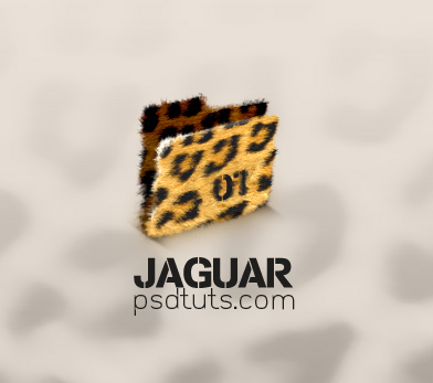
Before we get started, let's take a look at the image we'll be creating. As always, the layered Photoshop file is available via our PSDTUTS Plus membership.
Introduction
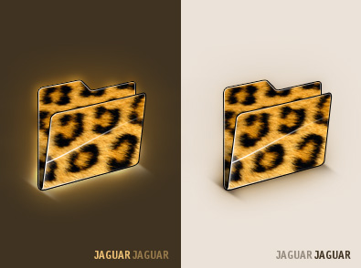
Let's look at how this tutorial differs from other icon tuts across the net. First of all, a process like this can be applied to other objects (of course bigger object). Also, with icons the object can be viewed in its full size. Above all, any tiny inaccuracy can be easily corrected, or is small enough that it can't be seen at all. So it's possible to keep the length of the article standard without skipping any steps needed to create this Jaguar style.This tutorial concept was made some time ago. After a few hours of creating in Photoshop, I made what you can see below. It is a folder, but I wasn't fully satisfied with this design, so I left the project for a while. Later, I came back to it with new strength and ideas. This serves as some advice for you in this article. Consider, opening your old work and trying to improve it. You can breathe new life into your old projects.
Step 1
Although we don't need the exact shape of the folder, let's show how to create such a shape. First, create a new document, where we fill 128 px by 128 px with a grey color, as show in (1), this is the area where the folder must fit. Then we draw the shape of folder with the Pencil Tool, as shown in (2). Then set the Grid on every pixel, shown in (3). Then begin redrawing the shape with the Pen Tool, as shown in (4) - (6).
Step 2
We keep doing this until the whole shape is drawn.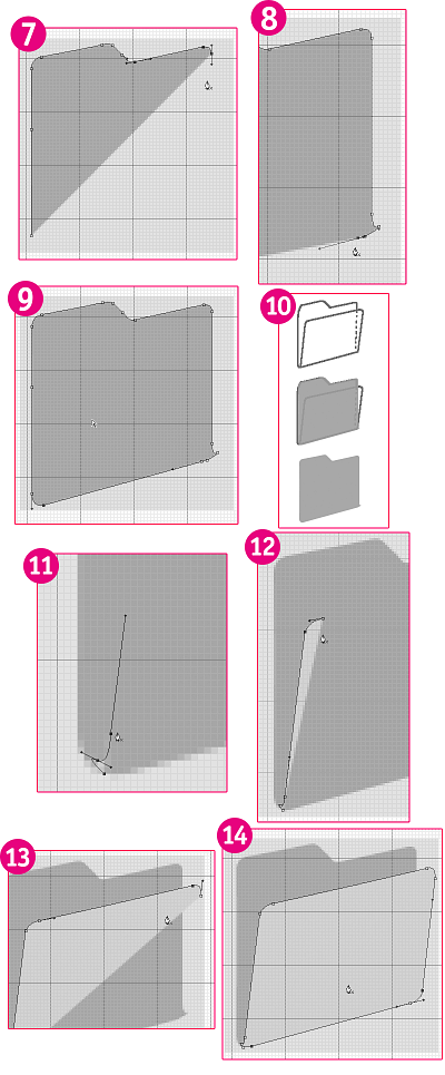
Step 3
Here is the example of the original drawing, and the new one created with the Pen Tool. Anyway, the original drawing (sketch) is enough to continue the process.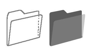
Step 4
Naturally, we need a good texture, which can be downloaded here.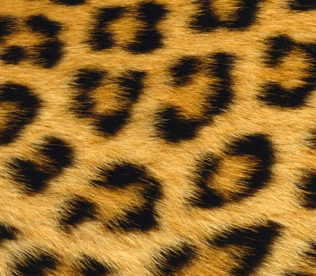
Step 5
Next, let's try to mask certain part of the texture, so it looks "furry" on the edges. Then change the layer to a folder size. Go to Channels Palette, and find the right one with as big a contrast as possible. In our case, it's the Red Channel.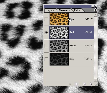
Step 6
Choose it (Ctrl + A). Then copy and paste it into the document. Then adjust the Levels so the white color. It is really white and black is black. Also, the middle tones may be lowered.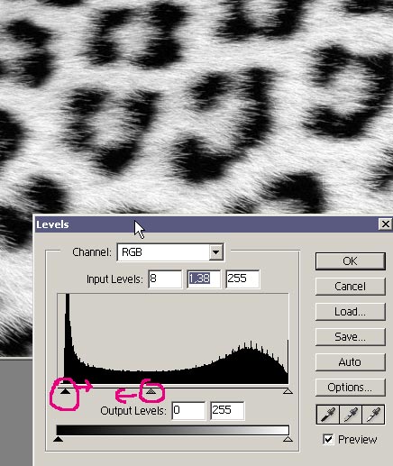
Step 7
Zoom in on the whole picture, and try to find a gradient between black and white, which should be used to create a brush. Then select the area, and duplicate it to a new layer (Ctrl + J).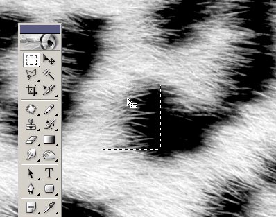
Step 8
Hide the original layer. Then adjust this layer for the brush trail. We can use Levels again, or the Dodge/Burn Tools.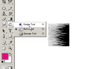
Step 9
This way we have good control over everything. All we want to do is make the white part really white and the black part black. We keep adjusting it until it looks like the image below.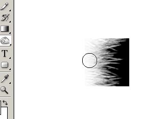
Step 10
When we are happy, we can choose again with Shift + Ctrl + D. Then invert the layer (Ctrl + I), and make it a new brush trail.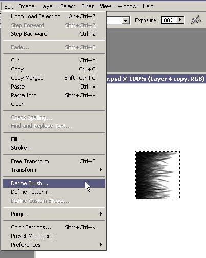
Step 11
Open the Brushes Palette.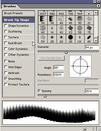
Step 12
Set the random size with Size Jitter of 100% and Angle Jitter of 9%. Notice the other settings shown below as well.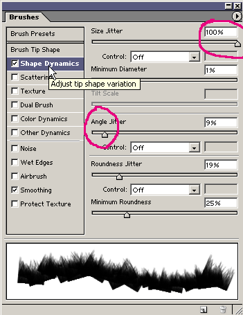
Step 13
Then add a color mask to the original (color) layer. Fill this with a black color. Then start drawing with a grass brush, and use a white brush trail.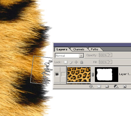
Step 14
Set the right Angle for every side.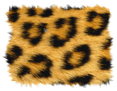
Step 15
We have finished the rough outline, now it's time to finish details. We can use a standard Photoshop brush next. Set the right size and angle, and draw into the mask.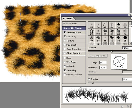
Step 16
As soon as the layer looks "furry" enough, copy it, and make the folder smaller (Ctrl + T).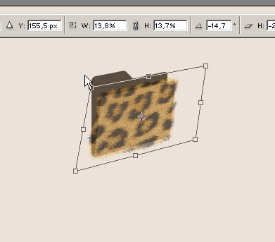
Step 17
Note that any shape imperfection can be corrected easily.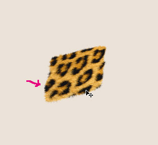
Step 18
Next grab the Smudge Tool and set it to the right brush.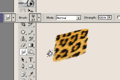
Step 19
Make the second layer smaller in accordance with the back side of the folder, which is where we must cut into it on the right, as shown below.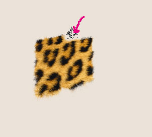
Step 20
This is how both layers look merged.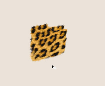
Step 21
It's necessary to make the back layer darker. This can be done by adding a new adjustment layer of Brightness/Contrast, which must be set as a cutting mask (Ctrl + Alt + G). Then lower the Brightness to -100.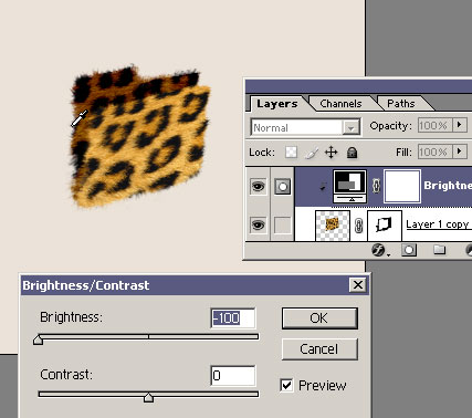
Step 22
Then we can make the front layer brighter.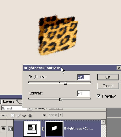
Step 23
Next we add some reflections. Although, we must respect that fur doesn't have any reflection, so we come back to the "grass" brush trail we created and draw with it on the edges.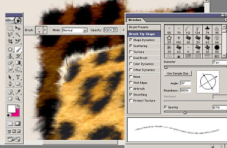
Step 24
It should be made irregularly, to make the reflection look real. The Smudge Tool can be used again.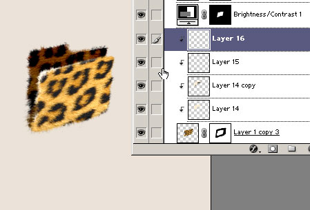
Step 25
Then add a shadow, and our icon is finished. Or it isn't?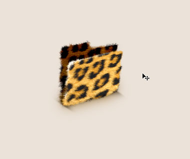
Step 26
If you want to continue, you can add a label. All you have to do is erase one spot with the Clone Stamp Tool.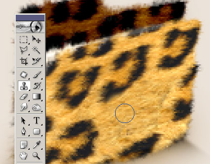
Step 27
Then create a new text layer.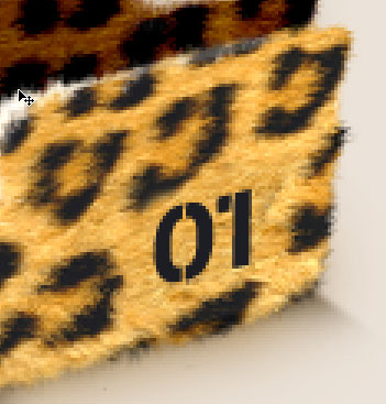
Step 28
Next we add some random brush strokes over the layer, and add one darker spot under it.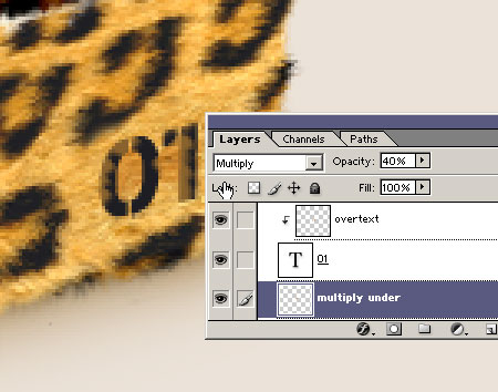
Step 29
We finish it all with the grass shaped brush. Keep in mind, the drawing must be made according to the angle of the fur.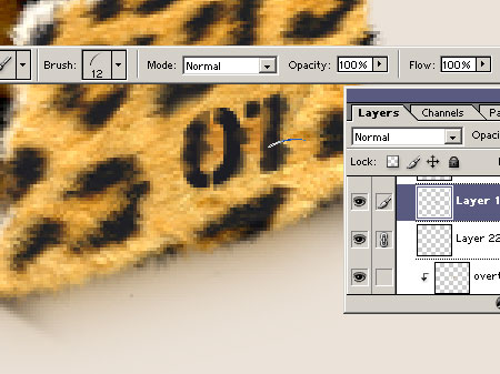
Step 30
Don't "blur" it too much, as you want it to be readable.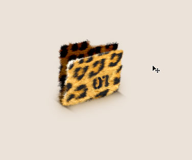
Step 31
Still want more? OK, one last step. To create the background blur the original layer with a Median filter, so the hair is lost, but the outline is still good.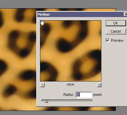
Step 32
Next we set the layer to Luminosity, and add a layer mask Then a draw gradient within the layer mask going from black to white.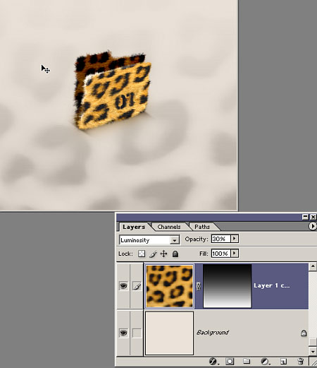
Final Result
We add some text, and now our icon design is finished! Good luck with your work, and I wish you many great ideas!

